← All work · Concept project
Blue Meadow HVAC
A concept site for a fictional Central Florida AC company, built so a homeowner with a dead air conditioner can call or book in one tap.
- Client
- Blue Meadow HVAC (fictional)
- Industry
- Trades
- Services
- Design, Development, SEO
- Live site
- Coming soon
The challenge
- 7–24 secLoad time on a phone at 3 of 4 local sites
- 1 of 4Sites that showed a license number
- 2 of 4Sites with no reviews
- 9 fieldsLongest homepage form we found
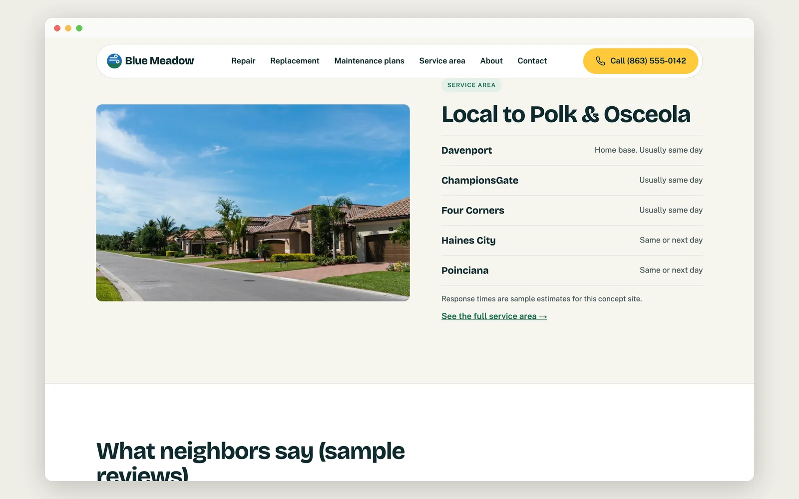
Blue Meadow HVAC is a fictional, family-run AC company serving Davenport, ChampionsGate, Haines City, Four Corners and Poinciana in Florida. Most calls come from homeowners whose AC just stopped in the heat. The rest come from people comparing companies before a replacement.
We looked at ten local HVAC websites to see what gets in a stressed customer's way. Three took 7 to 24 seconds to show their main content in a standard phone speed test. On some, the phone number wasn't visible when the page first opened. Only one showed a license number, two had no reviews, and the forms were missing from the homepage or asked for nine fields.
The goal was a site that gets someone with a broken AC to a call or a short form in one tap.
Our approach
Easy to read in the sun
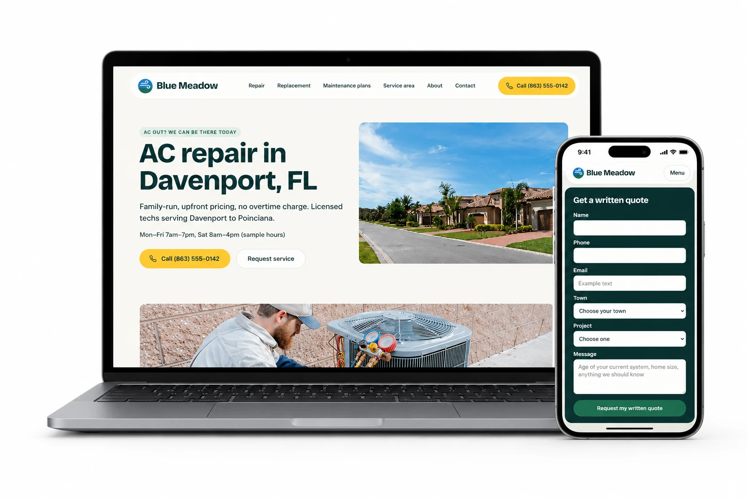
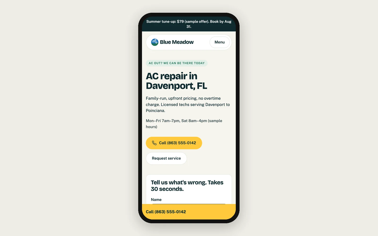
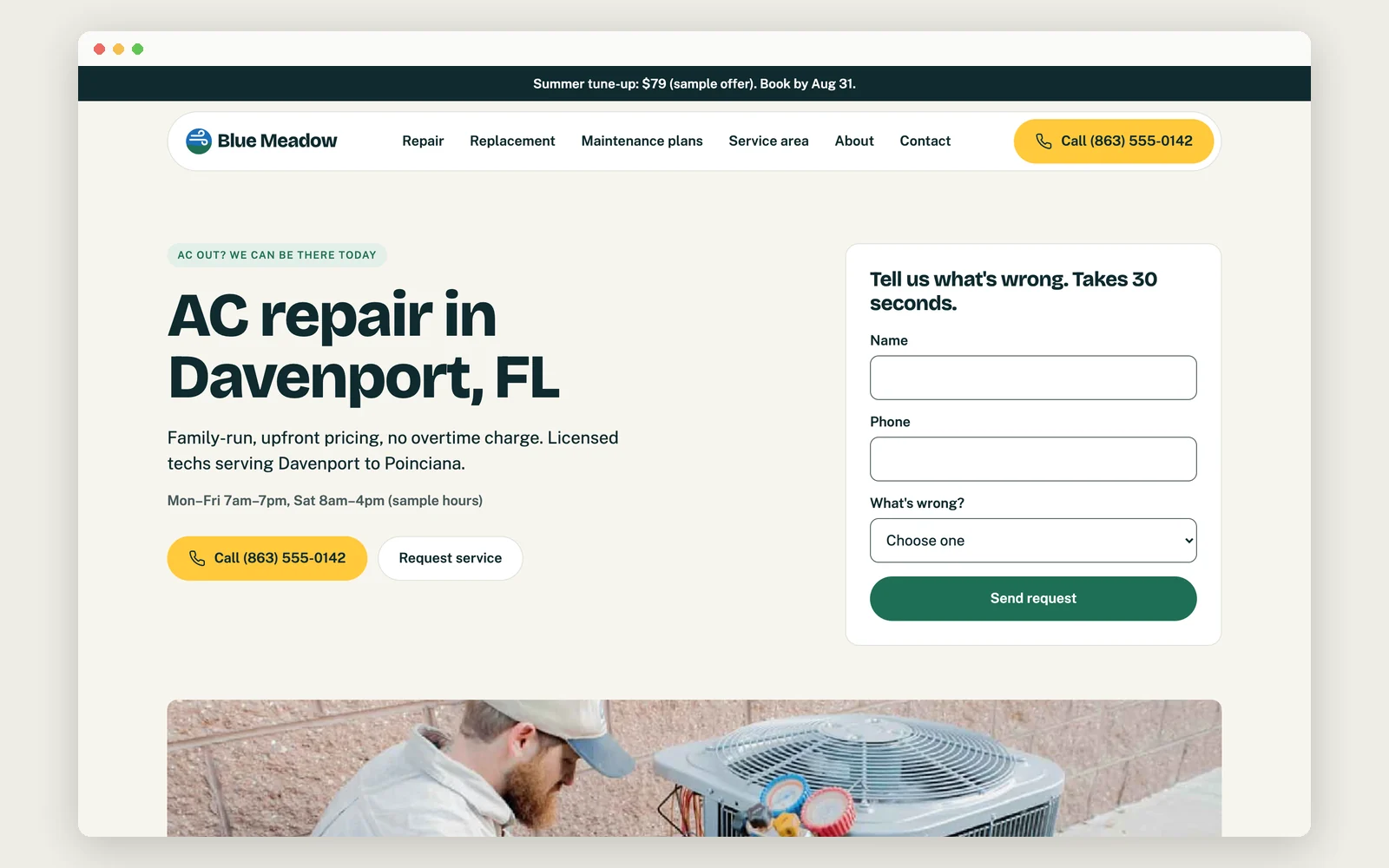
The colors are meadow green and sky blue on a warm off-white background instead of stark white, which cuts glare outdoors. The four sites we looked at all use navy, red or orange. Yellow is saved for the call button alone, and it stayed the easiest thing to spot when we simulated bright sun glare.
A first screen built for emergencies
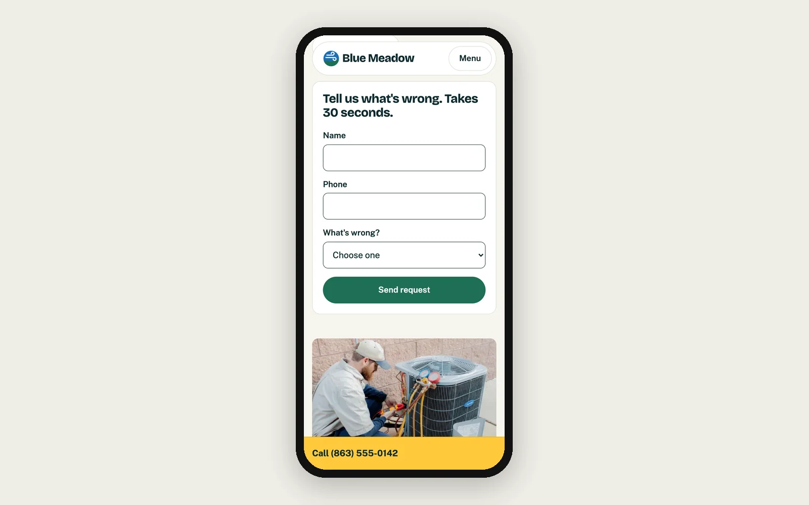
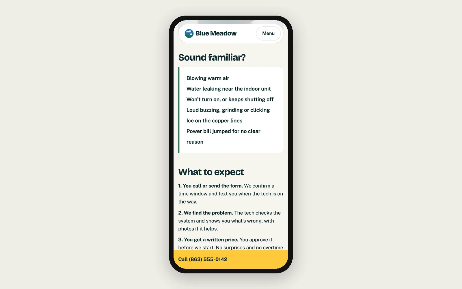
The first screen says what a stressed customer needs: we can come today, our hours, a call button, and a short form that asks only for name, phone and what's wrong. On a phone, the call button becomes a bar that stays at the bottom of the screen as you scroll. Every button and link is big enough to tap easily. People who want a full quote use a separate, longer form, so the emergency one stays short.
Works for every visitor
The menu and the FAQ work even if the page's scripts don't load, and by keyboard alone. Form borders are dark enough to see in bright light, because the brand's usual light gray was too faint to meet the accessibility standard. There are no sliding carousels, scrolling background effects or auto-playing video.
Honest trust signals the owner can update
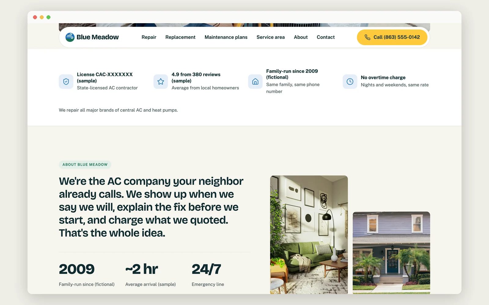
License number, years in business and rating sit near the top, but in this concept they are labeled placeholders. The reviews are marked as samples, and we didn't tell search engines to show star ratings because the ratings aren't real. Hours, the promo banner and the phone number are stored in one place, so the owner changes them once and every page updates.
How it tested
- 91Speed scoreSource: PageSpeed Insights, mobile, middle of 3 runs, 2026-10-05
- 92Accessibility scoreSource: PageSpeed Insights, mobile, 2026-10-05
- 100Search basics scoreSource: PageSpeed Insights, mobile, 2026-10-05
- 100Best practices scoreSource: PageSpeed Insights, mobile, 2026-10-05
- Text visible after 2.1 seconds on a phone, down from 3.3Source: PageSpeed Insights, mobile, 2026-10-05
- Main content visible after 3.2 seconds on a phoneSource: PageSpeed Insights, mobile, 2026-10-05
- Page stays steady while loading: layout shift 0.018Source: PageSpeed Insights, mobile, 2026-10-05
What we built
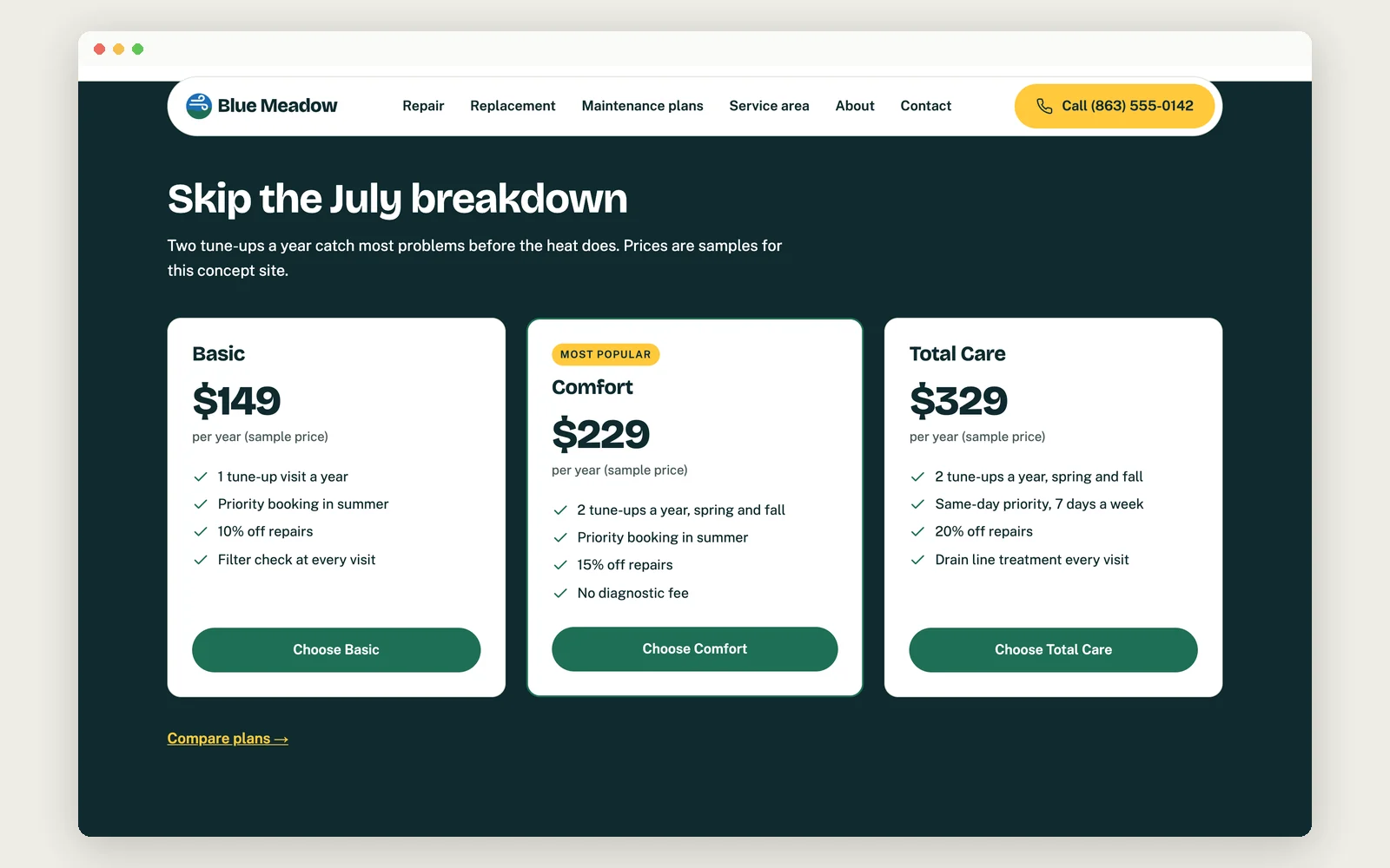
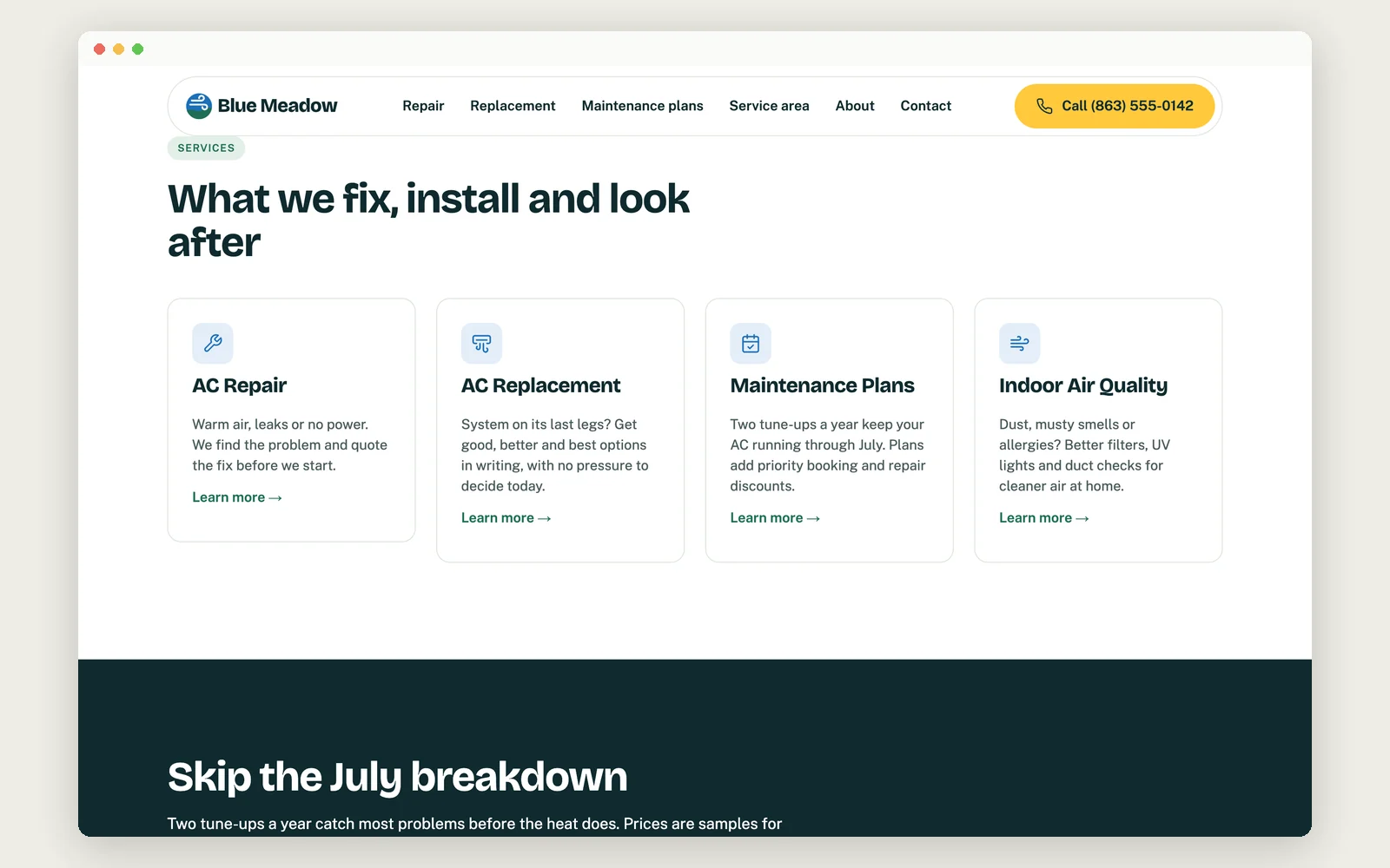
The concept site has five pages plus four service pages, each with its own title and description for search results. Every phone number, license number and review on it is a labeled placeholder.
We tested the home page the way a customer would see it: on a simulated mid-range phone with a slow connection, using Google's PageSpeed Insights. The first test scored 81 for speed. The fonts were loading through a separate Google service that held the page up before anything could show. We moved them onto the site itself, and speed rose to 91, with text appearing after 2.1 seconds instead of 3.3. Search basics and best practices both scored 100.
Accessibility scored 92 against a goal of 98, mostly because some form dropdowns aren't labeled for screen readers. We haven't yet run the five-person emergency-request test or timed the owner editing the hours.